Introduction
This guideline acts as the official document to follow in your projects. Udacity reviewers will use this guide to grade your projects(along with the respective rubrics). All Android apps that you code in your projects should meet the criteria listed below. For a more detailed set of rules to assess the basic quality of your apps with, refer to this link.
Optimize Layouts for Larger Screens
To give the users the best possible experience on several screen configurations, make sure you optimize the layout and the UI for targeted screens. On tablets, optimizing the layout involves making use of the additional screen space to offer new features, present new content, or enhance the experience in other ways to deepen user engagement.
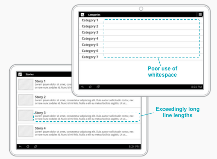
Not Recommended:
Get rid of "stretched" UI: On tablets, single-pane layouts lead to awkward whitespace and excessive line lengths.
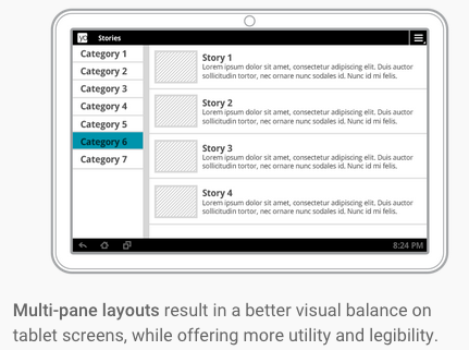
Use padding to reduce the width of UI elements and consider using multi-pane layouts.

Recommended:
- Lines of text should not be excessively long — optimize for a maximum 100 characters per line, with best results between 50 and 75.
ListViews and Menus should not use the full screen width.- Padding of UI elements should normally be larger on tablets than on handsets. Adequately pad text content so that it is not aligned directly along screen edges. Use a minimum
16dp padding around content near screen edges.
- At a minimum, customize dimensions such as font sizes, margins, spacing for larger screens, to improve use of space and content legibility.
- Provide custom layouts as needed for
large and xlarge screens.
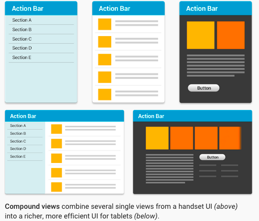
Take Advantage of Extra Screen Area
Recommended:
Use Assets Designed for Tablet Screens
Recommended:
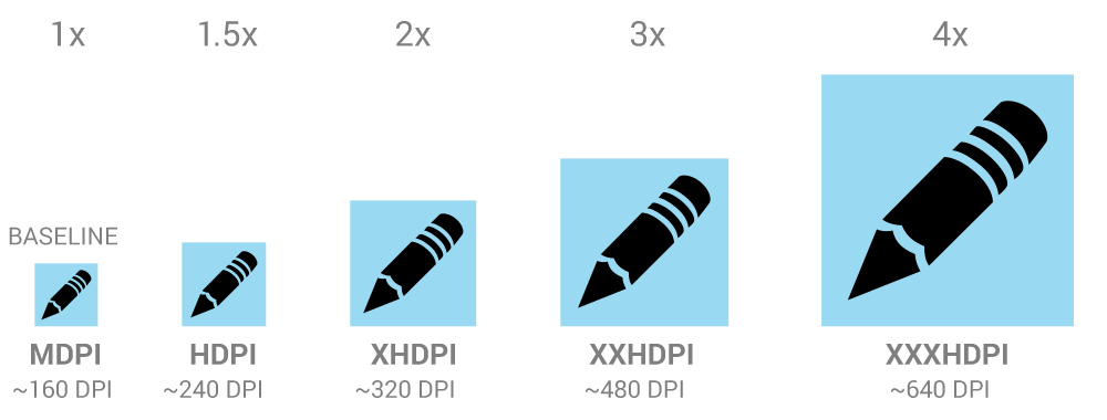
Design your icons and other bitmap assets for your application, the action bar, notifications, and launcher according to the Iconography guidelines and provide them in multiple densities, so they appear at the appropriate size on all screens without blurring or other scaling artifacts.


As a minimum, supply a version of each icon and bitmap asset that's optimized for at least one the following common tablet screen densities: hdpi, xhdpi and xxhdpi.
Tablets often request a launcher icon that is one density size larger than the device's actual density, so you should provide your launcher icon at the highest density possible. For example, if a tablet has an xhdpi screen, it will request the xxhdpi version of the launcher icon.
Use density-specific resource qualifiers to ensure that the proper icons are loaded for each screen density.
Use vector shapes when designing icons, so they scale without loss of either detail or edge crispness.
Adjust Font Sizes and Touch Targets
Recommended:
- Text should not be excessively large or small on tablet screen sizes and densities. Make sure that labels are sized appropriately for the UI elements they correspond to, and ensure that there are no improper line breaks in labels, titles, and other elements.
- The recommended touch-target size for onscreen elements is 48dp (32dp minimum) — some adjustments may be needed in your tablet UI.
- When possible, for smaller icons, expand the touchable area to more than 48dp using TouchDelegate or just centering the icon within the transparent button.
Full Feature Set for Tablet Users
Recommended:
- Design your app to offer at least the same set of features on tablets as it does on phones.
- In exceptional cases, your app might omit or replace certain features on tablets if they are not supported by the hardware or use-case of most tablets. For example:
- If the handset uses telephony features but telephony is not available on the current tablet, you can omit or replace the related functionality.
- If you will omit a feature or capability from your tablet UI, make sure that it is not accessible to users or that it offers “graceful degradation” to a replacement feature.
Target Android Versions Properly
To ensure the broadest possible distribution to tablets, make sure that your app properly targets the Android versions that support tablets.
At a minimum, check the <uses-sdk> element to make sure that:
targetSdkVersion is declared with value 11 or higher (14 or higher is recommended), ORminSdkVersion is declared with value 11 or higher.- If a
maxSdkVersion attribute is declared, it must have a value of 11 or higher. Note that, in general, the use of maxSdkVersion is not recommended.
Declare Hardware Feature Dependencies Properly
Handsets and tablets typically offer slightly different hardware support for sensors, camera, telephony, and other features. For these reasons make sure your appdoes not require hardware features that are not commonly available on tablets. Declare the hardware features as not required in the app manifest, as described below:
After adding the not required attribute, make sure to check that your app functions without any errors in a variety of devices. This makes sure the app offers "graceful degradation" and alternative functionality wherever appropriate.
Declare Support for Tablet Screens
To ensure that you can distribute your app to a broad range of tablets, your app should declare support for tablet screen sizes in its manifest file, as follows:
- A
<supports-screens> element, if declared, must not specify android:largeScreens="false" or android:xlargeScreens="false".
- For apps targeting
minSdkVersion value less than 13, a <supports-screens> element must be declared with both android:largeScreens="true" and android:xlargeScreens="true".
