 Responsive Images quiz by Cameron Pittman
Responsive Images quiz by Cameron Pittman
Taking advantage of sizes alongside srcset gives you a very powerful combination for responsive images. This quiz is here to help you practice giving the browser the ability to decide which image it should download based on media queries and image width.
Modify this page using DevTools. When it meets all the requirements listed in the Udacity Feedback, a code will appear. Type that code into the Udacity classroom to continue.
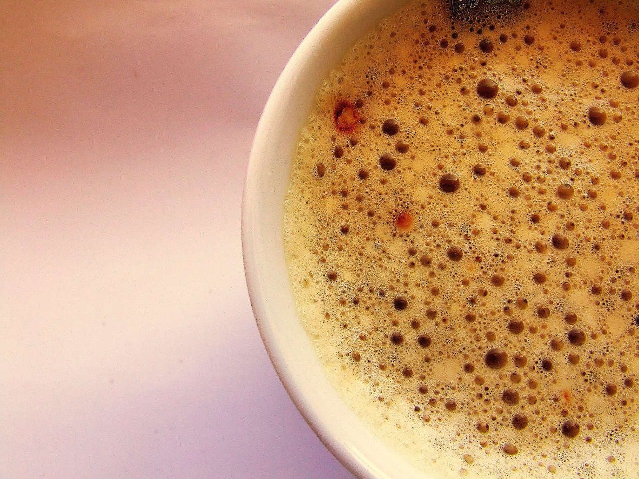
sizes and srcsetThat coffee looks delicious. You know what's even more delicious? Responsive images based on media queries :) Help the browser determine the right image to download using srcset to specify images with different natural resolutions and sizes to tell the browser how wide the image will be on the page using media queries.
For this quiz, I want you to tell the browser to download that it has the option of using Coffee_1280w.jpg and Coffee_640w.jpg, which have widths of 1280px and 640px respectively. Tell the browser that the image will display at 50vw if the page is smaller than 960px wide, otherwise the image displays at 100vw.
Make your changes with DevTools!