 Responsive Images quiz by Cameron Pittman
Responsive Images quiz by Cameron Pittman
srcset is super useful. This quiz is here to help you practice giving the browser the ability to decide which image it should download based on its device pixel ratio and width.
Modify this page using DevTools. When it meets all the requirements listed in the Udacity Feedback, a code will appear. Type that code into the Udacity classroom to continue.
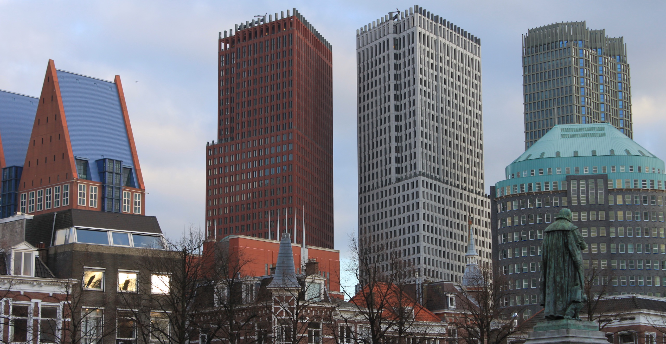
srcset Using DPIDen Haag's skyline looks like it's ready for a retina display. Help the browser determine the right image to download using srcset. It should download Den_Haag_2x.jpg if it is a 2x display and Den_Haag_1x.jpg if it is a 1x display.
Make your changes using Chrome DevTools!
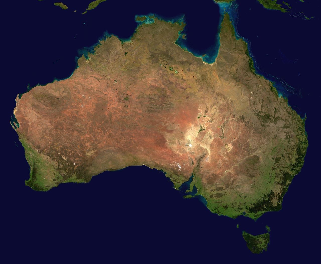
srcset Using Image WidthAustralia looks like it's ready for tablet and desktop, but it's probably too wide for mobile. Fix that with srcset. Tell the browser that Australia_1280w.jpg is 1280px wide and Australia_640w.jpg is 640px wide so that the browser can choose the best one to download.
Make your changes using Chrome DevTools!